


Abstract
NASA’s Interstellar Boundary Explorer (IBEX) mission has operated in space for a full solar activity cycle (Solar Cycle 24), and IBEX observations have exposed the global three-dimensional structure of the heliosphere and its interaction with the very local interstellar medium for the first time. Here, we extend the prior IBEX observations of energetic neutral atoms (ENAs) by adding a comprehensive analysis of four additional years (2016 through 2019). We document several improvements and rerelease the entire 11 yr, IBEX-Hi data set. The new observations track the continuing expansion of the outer heliosphere’s response to the large solar wind pressure increase in late 2014. We find that the intensification of ENAs from the heliosheath continued to expand progressively over time to directions farther from the initial, closest direction to the heliospheric boundaries, ∼20° south of the upwind direction. This expansion extended beyond the south pole in 2018 and the north pole in 2019, demonstrating that the termination shock and heliopause are closer in the south. The heliotail has not yet responded, indicating that the boundaries are significantly farther away in the downwind direction. Finally, the slow solar wind (∼1 keV) ENAs just started to intensify from the closest regions of the IBEX Ribbon. This is about two and a half years after the initial response from heliosheath ENAs and about four and a half years after the increase in solar wind output, both clearly implicating a “secondary ENA” source in the draped interstellar magnetic field, just beyond the heliopause.
1. Introduction
The Interstellar Boundary Explorer (IBEX; McComas et al. 2009a) launched on 2008 October 19. IBEX provided the first ever observations of energetic neutral atoms (ENAs) from the outer heliosphere and has been returning nearly continuous observations of the heliosphere’s interaction with the very local interstellar medium (VLISM) over the 11 yr since. ENAs are produced by charge exchange between energetic ions and low-energy interstellar neutral atoms drifting in from the VLISM. A special issue of Science in 2009 November published the IBEX first results (Funsten et al. 2009b; Fuselier et al. 2009a; McComas et al. 2009b; Möbius et al. 2009; Schwadron et al. 2009). Since then, the IBEX scientist team has been extremely prolific, publishing well over 300 refereed papers through 2019, which include over 50 “firsts” and discoveries by the IBEX mission (see Table 1 in McComas et al. 2017 and studies since then).
IBEX made the first measurements of the ENA globally distributed flux (GDF; McComas et al. 2009b), which is produced largely in the heliosheath—the region beyond the termination shock (TS) and inside the heliopause. IBEX also discovered (McComas et al. 2009b) a narrow (∼20° wide at 0.7–2.7 keV; Fuselier et al. 2009a) and nearly circular (Funsten et al. 2009b, 2013) band of enhanced emissions of ENAs encircling the sky; this feature, dubbed the “IBEX Ribbon,” was completely unanticipated by any model or theory at the time of its discovery. The Ribbon is consistent with the locus of directions where the draped interstellar magnetic field is perpendicular to a radial line of sight from the Sun and IBEX (Schwadron et al. 2009). This ordering shows that our heliosphere’s interstellar interaction is intermediate between the dynamically and magnetically dominated extremes (McComas et al. 2009b) as theorized originally by Parker (1961).
With the original discovery of the IBEX Ribbon, McComas et al. (2009b) suggested multiple ideas for possible physical sources of/mechanisms to produce the Ribbon. These included possible sources that spanned from inside the TS, through the heliosheath, at the heliopause, and beyond into the VLISM. These authors also provided the first suggestion of a “secondary ENA” source process. Since then, over a dozen possible Ribbon sources have been identified and progressively more carefully examined (see McComas et al. 2011b, 2014b, 2017).
While there has not been a conclusive determination of the source of the IBEX Ribbon, numerous observations are pointing to some sort of secondary ENA process. All secondary ENA processes have the following three steps: (1) a fraction of the ions in the solar wind and inner heliosheath become neutralized and travel outward, (2) these “primary” neutrals are reionized and captured in the VLISM within several hundred au beyond the heliopause, and (3) a few years later, on average, these ions charge exchange again, producing secondary ENAs that come back into the heliosphere. If the captured ions stay in ring-beam distributions (Chalov et al. 2010; Gamayunov et al. 2010; Heerikhuisen et al. 2010; Möbius et al. 2013; Zirnstein et al. 2018a), or are trapped with largely perpendicular pitch angles by turbulent structures in the local interstellar magnetic field (Giacalone & Jokipii 2015; Zirnstein et al. 2020b), then the secondary ENAs will preferentially radiate more perpendicularly to the local magnetic field. Alternately, Ribbon emissions can also arise if the partial density of captured ions build up where the field is almost perpendicular to the outward radiating neutralized solar wind, as could happen through spatial confinement via strong scattering and wave–particle interactions (Schwadron & McComas 2013, 2019; Isenberg 2014).
On the observational side, McComas et al. (2012) found that IBEX ENA observations from 2009 to 2011 reflected the bimodal (slow/fast) distribution of the outflowing solar wind (McComas et al. 1998) over the past protracted solar minimum (McComas et al. 2008, 2013a), indicating that the solar wind must be a fairly direct source of the Ribbon ENAs. Subsequent IBEX observations from 2014 to 2015 showed that the Ribbon had lost this ordering after an appropriate time delay from more solar maximum solar wind conditions, which again is consistent with a solar wind source beyond the heliopause (McComas et al. 2017, pp. 1). These authors concluded that “together, the IBEX observations strongly support a secondary ENA source for the Ribbon, and we suggest that this be adopted as the nominal explanation of the Ribbon going forward.”
With respect to temporal evolution more broadly, even the first two sets of six-month maps from IBEX data suggested that there may have been time variations in the ENA fluxes arriving from the outer heliosphere (McComas et al. 2010). Then, as the IBEX data grew beyond the originally planned two-year mission, it became clear that the ENA fluxes were indeed varying significantly over time. The primary studies that examined the all-sky variations in flux were McComas et al. (2012), the first three years of IBEX observations; McComas et al. (2014a), the first five years; and McComas et al. (2017), the first seven years.
Collectively, these studies showed a general decrease in the ENA fluxes from 2009 to 2012, and leveling off from 2013 to 2017 over much of the sky, especially on the upwind side. In contrast, the downwind/heliotail side fluxes generally continued to fall. These results are consistent with significantly greater “recycle” times for the solar wind and the embedded pickup ions it incorporates on the way out to the TS. The recycle time includes several elements. First, the typical slow solar wind (∼400 km s−1) reaches the nearest portion of the TS (∼100 au away from the Sun) in a bit less than a year and incorporates interstellar pickup ions throughout its outward transit. The solar wind and pickup ions are slowed and heated at the TS; if neutralized in the heliosheath, some of these come back into the inner heliosphere as ENAs. At the same 1 keV energy, it is roughly another year for ∼1 keV ENAs to return over this distance (and about half a year for ∼4 keV ENAs). In the heliosheath, the plasma flows are slower and processing times vary from a year or two near the nose to longer times at the poles/flanks, and even longer ones toward the tail owing to different plasma flows and longer lines of sight (e.g., Zirnstein et al. 2017).
Other studies focused on time variations in the polar regions (Allegrini et al. 2012; Dayeh et al. 2012, 2014; Reisenfeld et al. 2012, 2016), where IBEX has essentially continuous viewing, better statistics, and where, in principle, more rapid variations could be observed. However, these authors generally found that the fastest time variations in the IBEX ENA data in the earlier half of the mission were still around half a year (Reisenfeld et al. 2012; Dayeh et al. 2014). Another interesting result is an energy-dependent recovery from the polar ENA fluxes, with lower energies preceding higher energies (Reisenfeld et al. 2016), which is the opposite of that expected from the fact that higher energy ENAs travel back faster than lower energy ones. These authors suggested that the disappearance of fast solar wind at high latitudes during solar maximum caused the high-energy ENA fluxes to continue decreasing at these latitudes.
McComas et al. (2017) pointed out a large (∼50% from ∼1.6 to ∼2.4 nPa) and persistent solar wind dynamic pressure enhancement in the second half of 2014 and predicted that this would significantly enhance ENA emissions from the outer heliosphere after an appropriate delay. Previously, McComas et al. (2013a) showed that the dynamic pressure was essentially identical in the ecliptic plane and at high latitudes on Ulysses at the same times. This means that ecliptic measurements during the IBEX epoch can be safely used as global indicators of the solar wind output over all latitudes. McComas et al. (2017) anticipated that the 2014 enhancement would first come from higher energy ENAs, which travel back faster than lower energy ones, and from the nearest portion of the inner heliosheath ∼20° south of the upwind direction (McComas & Schwadron 2014; Schwadron et al. 2014), and then expand out to the next nearest region of the heliosheath from there.
McComas et al. (2018b) subsequently observed exactly this progression and showed that enhanced emissions began in late 2016 at higher energies, from south of the nose, and expanded out from there. They further used the timing of the related transient pressure pulse at Voyager 2 to show that the ENA enhancement from the heliosheath only began once the pulse had reflected back in from the heliopause and the heliosheath had substantially filled in with enhanced solar wind plasma. Zirnstein et al. (2018b) examined the outer heliosphere’s response to the pressure increase, comparing it to a three-dimensional, time-dependent simulation and demonstrating how the expansion of the pulse throughout the heliosheath created a “ring” of changing ENA fluxes across the sky. Schwadron et al. (2018) followed the Ribbon separation process of Schwadron et al. (2011, 2014) for 2009–2017, showing that GDF ENA emissions respond before the Ribbon, as expected for a secondary ENA mechanism beyond the heliopause that includes a several-year reneutralization time. Finally, McComas et al. (2019a) showed the continued expansion of the region of enhanced ENA emissions as it first extended primarily to the north and then out in all four directions, painting a clear picture of the next nearest regions of the heliosheath.
This study extends the prior work of McComas et al. (2012, 2014a, 2017) and provides the full documentation for the 8th through 11th years (2016–2019) of the IBEX-Hi (Funsten et al. 2009a) ENA observations, as well as the rerelease, with improved background subtraction and correction factors, of years one through seven (2009–2015). As in our three prior update papers, Section 2 shows the new observations in the context of the full data set and provides updated and complete sets on now-standard data products that the community can use for further scientific analysis, comparison, simulation, and study. In Section 3, we examine the time variations of the ENA fluxes over a full solar cycle of observations for the first time. Importantly, this includes considerable new information about the outer heliosphere’s response to the large increase in solar wind output and dynamic pressure in the second half of 2014 and new observations beyond those shown by McComas et al. (2019a). Finally, Section 4 provides conclusions and a look to the future and the Interstellar Mapping and Acceleration Probe (IMAP; McComas et al. 2018a), currently under development for launch in late 2024. Collectively, the new results in this study significantly advance our understanding of the heliosphere’s interaction with the VLISM.
This study also provides the new citable reference for the first 11 years of IBEX-Hi data and the most up-to-date and complete release of the IBEX ENA data set. In it, we have corrected a couple of minor processing bugs and include the best corrections to and validation of the data that the IBEX team can currently provide. All researchers are urged to use this data release and the current paper with its supporting information for all future IBEX studies. The appendices provide additional documentation for researchers using the IBEX data: Appendix A describes the processing improvements incorporated in this new data release and identifies the specific source files at the ISOC used to generate the figures in this study; Appendix B updates the orbit-by-orbit survival probability corrections used in this study. Data used in this study constitute Data Release #16 and are available at ibex.princeton.edu on our data site: https://ibex.princeton.edu/DataRelease16, and have been submitted to the archive at the National Space Science Data Center (NSSDC): http://nssdc.gsfc.nasa.gov/.
2. A Solar Cycle of IBEX Observations
The IBEX spacecraft is a Sun-pointed spinner (∼4 RPM), with two single-pixel ENA cameras (IBEX-Hi and IBEX-Lo), which view perpendicularly to the spin axis (McComas et al. 2009a). IBEX-Hi measures ENAs with energies from ∼0.5 to 6 keV in six energy bins (Funsten et al. 2009a) and IBEX-Lo measures ENAs from ∼0.01 to 2 keV in eight energy bins (Fuselier et al. 2009b). Each spacecraft rotation, both IBEX-Hi and -Lo collect ENAs over the great circle perpendicular to the spacecraft spin axis. Every few days, we repoint IBEX’s spin axis to track the Sun as its inertially fixed direction drifts relative to Sun at ∼1° per day owing to Earth’s orbital motion. The combination of spinning and repointing provides 4π sr viewing every six months. Thus, the IBEX team produces new sets of energy-resolved all-sky ENA maps twice per year. While only planned for a two-year mission, the health of the spacecraft and both instruments remains excellent, and IBEX has now made nearly continuous observations for a full solar activity cycle of 11 years.
As in McComas et al. (2017), we designate data from the first six months of each year as “A” maps and the second half as “B” maps. Table 1 provides the detailed dates and orbit/orbit arc numbers for all 22 energy-resolved sets of six-month maps, as well as the 11 full-year maps.
Table 1. Data Intervals Used for IBEX Maps
| Year (Annual Maps) | 6 month Maps | Orbit/Arc Numbers | Dates (Start/End of Orbits or Arcs) |
|---|---|---|---|
| Year 1 (2009 Map) | 2009A | 11–34 | 2008 Dec 25–2009 Jun 25 |
| 2009B | 35–58 | 2009 Jun 25–Dec 25 | |
| Year 2 (2010 Map) | 2010A | 59–82 | 2009 Dec 25–2010 Jun 26 |
| 2010B | 83–106 | 2010 Jun 26–Dec 26 | |
| Year 3 (2011 Map) | 2011A | 107–130a | 2010 Dec 26–2011 Jun 25 |
| 2011B | 130b–150a | 2011 Jun 25–Dec 24 | |
| Year 4 (2012 Map) | 2012A | 150b-170a | 2011 Dec 24–2012 Jun 22 |
| 2012B | 170b–190b | 2012 Jun 22–Dec 26 | |
| Year 5 (2013 Map) | 2013A | 191a-210b | 2012 Dec 26–2013 Jun 26 |
| 2013B | 211a–230b | 2013 Jun 26–Dec 26 | |
| Year 6 (2014 Map) | 2014A | 231a–250b | 2013 Dec 26–2014 Jun 26 |
| 2014B | 251a–270b | 2014 Jun 26–Dec 24 | |
| Year 7 (2015 Map) | 2015A | 271a–290b | 2014 Dec 24–2015 Jun 24 |
| 2015B | 291a–310b | 2015 Jun 24–Dec 24 | |
| Year 8 (2016 Map) | 2016A | 311a–330b | 2015 Dec 24–2016 Jun 23 |
| 2016B | 331a–351a | 2016 Jun 24–Dec 26 | |
| Year 9 (2017 Map) | 2017A | 351b–371a | 2016 Dec 26–2017 Jun 25 |
| 2017B | 371b–391a | 2017 Jun 25–Dec 25 | |
| Year 10 (2018 Map) | 2018A | 391b–411b | 2017 Dec 25–2018 Jun 28 |
| 2018B | 412a–431b | 2018 Jun 29–Dec 26 | |
| Year 11 (2019 Map) | 2019A | 432a–451b | 2018 Dec 27–2019 Jun 27 |
| 2019B | 452a–471b | 2019 Jun 28–Dec 26 |
Note. The first 7 years of data are unchanged from McComas et al. (2017) while years 8–11 are new.
Download table as: ASCIITypeset image
Over the course of the mission, we made three significant changes to further enhance the mission reliability and duration as well as the data quality:
- 1.In 2011 June (orbit 130), we carried out a major spacecraft maneuver, substantially raising the perigee and producing a very long-term lunar-synchronous orbit (McComas et al. 2011a). While not formally stable, this orbit should persist long past the decades of potential IBEX mission life. Through this maneuver, we also increased IBEX’s orbital period from ∼7.5 to ∼9.1 days. For the prior, shorter period, we only repointed the spacecraft once per orbit, around perigee; since the maneuver, we have been repointing twice per orbit, around both perigee and apogee. Thus, data from full orbits were combined before orbit 130, producing viewing bands offset by ∼7
 5, and after data are combined separately for the ascending (“a”) and descending (“b”) portions of each orbit, producing observational viewing bands offset by ∼45.
 - 2.Starting in orbit segment 184a, we modified the IBEX-Hi energy stepping sequence from the electrostatic analyzer (ESA) energy passbands 1-2-3-4-5-6 to 2-3-3-4-5-6. By removing ESA 1, which was often noisy and not very useful, we doubled the acquisition time for ESA 3 (center energy ∼1.1 keV), where the Ribbon is most easily observed (McComas et al. 2014a, Table 3, provides the detailed energy ranges of the various ESA passbands). After collecting enough of the extra ESA 3 data and reducing noise in ESA 1, we reverted back to the original IBEX-Hi 1-2-3-4-5-6 ESA sweep table starting in orbit segment 311a.
- 3.Finally, after regularly monitoring the efficiencies of the three channel electron multipliers (CEMs) and their interdependent coincidences, we detected a small, progressive decrease in the detector section efficiency. In the first half of 2014 (2014A), we responded by alternating the CEM voltages between their original voltage (1700V) and a slightly increased voltage (1780V) twice per orbit arc. This allowed us to precisely intercalibrate between the two levels and adjust the efficiencies applied to the observed counts. Analysis detailed in McComas et al. (2014a, Appendix C) indicates that the IBEX-Hi detector section triple-coincidence efficiency dropped linearly by roughly 10% over the first year and then stabilized. The increase in CEM operating voltage to 1780V increased the detector section efficiency by approximately 6%, which has been accounted for in the fluxes reported in this study.
The first 20 figures in this study show various sets of IBEX sky maps and other plots in the same format as McComas et al. (2017). In order to facilitate direct comparisons, we provide them in the same order, Figures 1–13 having the same figure number as in that paper and Figures 14–20 here corresponding to numbers 15–21 in that study (the old Figure 14 has been omitted). The only differences in the 2009–2015 data are owing to small improvements in the corrections and processing of those prior data. The addition of the last four years of observations (2016–2019) are shown as additional rows at the bottom of the 6 month individual maps and 12 month annual maps.
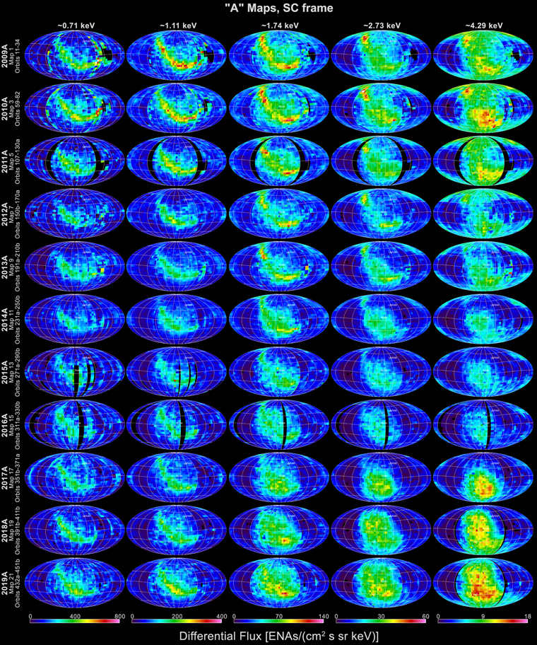
Figure 1. Mollweide projections of IBEX-Hi ENA “A” flux maps (from the first half of each year). Each of the columns represents one of the five energy passbands, while the rows show data from the 11 sequential years from 2009 to 2019. Black regions indicate no data.
Download figure:
Standard image High-resolution image2.1. IBEX ENA Data Processing
As in McComas et al. (2012, 2014a, 2017), for this study we use only the lowest background, triple-coincidence events (Funsten et al. 2009a) to produce flux maps for the five highest energy ranges of IBEX-Hi. We also continue to “cull” out times of enhanced backgrounds, including times when (1) there are high count rates in the IBEX Background Monitor (Allegrini et al. 2009); (2) there are enhanced counts at lower energies over a broad range of spin-phases; (3) the Moon or Earth’s magnetosphere is in the field of view; (4) there are enhanced solar energetic particles; or (5) rare internally generated bursts of counts occur.
Corrections for always-present backgrounds are applied in the same manner as in McComas et al. (2017) and include our best corrections for the time-variable cosmic-ray background and the residual background produced by the “ion gun” effect. We also cull out times of slightly enhanced isotropic background and calculate and subtract this additional isotropic background for a small number of orbits where statistics are low to improve the statistical accuracy of otherwise poorly resolved swaths. We continue to incorporate orbit-by-orbit survival probability corrections for measured ENA fluxes for new orbits covered in this study (Appendix B) and the time-varying efficiency correction to the IBEX-Hi ENA count rates introduced in McComas et al. (2017). Finally, as we did for the first time in that study, in Appendix A, we provide a detailed listing of the source files at the IBEX Science Operations Center (ISOC) used to generate each of the data figures in this study; this information should make it straightforward for outside researchers to use, or even reproduce, figures presented in this study.
2.2. Six-month “A” and “B” Sky Maps
Since the start of the IBEX mission and continuing through this study, we have provided ENA sky maps in Mollweide projections. For most of these maps, we center on the direction of the incoming interstellar neutral material flowing into the heliosphere defined by the relative velocity vector of the Sun with respect to the VLISM. Maps in this study continue to use the same inflow direction as in McComas et al. (2017), which is still the best inflow direction we know. Specifically, this inflow direction, which is the opposite direction to the actual VLISM flow, has an ecliptic longitude and latitude (λISM∞, βISM∞) of (2557, 51) (McComas et al. 2015).
Figures 1 and 2 show the energy-resolved IBEX-Hi all-sky ENA fluxes for the A (first half of each year) and B (second half of each year) maps, respectively. As in McComas et al. (2012, 2014a, 2017), we maintained the same color bars for each energy band across all the various figures for consistency. Even in these figures, the simplest of our IBEX sky maps, it is clear that the global ENA fluxes change substantially as a function of time and differently with different energies. Section 3 of this study examines the temporal variations in detail.
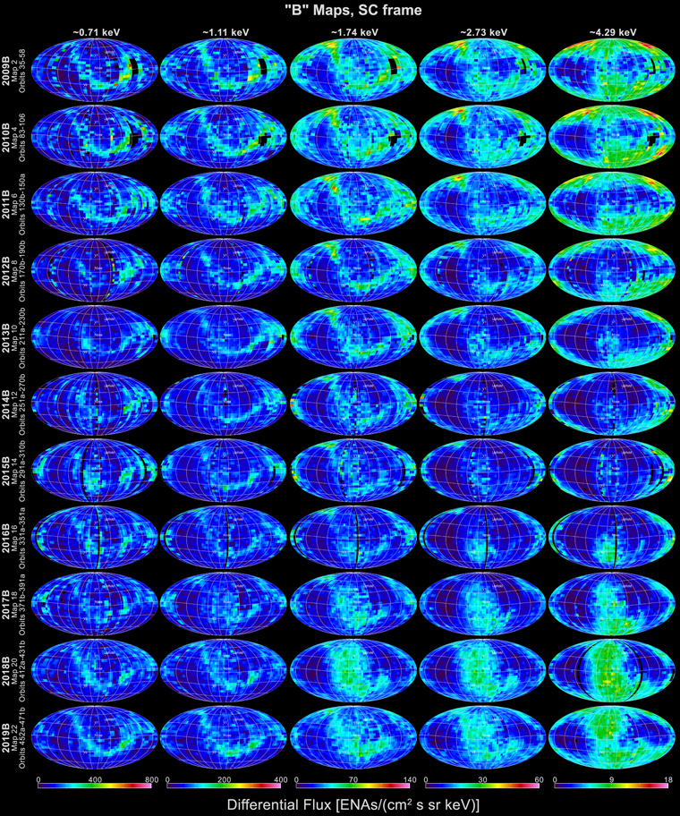
Figure 2. Same as for Figure 1, but for “B” maps (the second half of each year) through 2019.
Download figure:
Standard image High-resolution imageThe fluxes observed in the A and B sets of maps (Figures 1 and 2, respectively) show significant differences from each other. Because these are temporally interleaved (A from the first half of each year and B from the second), the differences are not simply due to temporal changes. In fact, most of the differences are due to the motion of the spacecraft (largely Earth’s orbital motion) with respect to the incoming ENAs. This motion produces a Compton–Getting (C–G) effect that enhances the flux across the central portions that view Earth’s orbital (ram) direction and reduces it on the left and right sides that view the opposite (anti-ram) direction in the A maps and reduces it in the central portion and enhances it the left and right sides of the B maps. The C–G effect also modifies the observed energy ranges with lower intrinsic energies sampled in the ram-viewing direction and higher energies on the anti-ram, particularly at the lower energies and latitudes.
In this study, we continue to use the C–G correction process developed by McComas et al. (2012) and used by McComas et al. (2014a, 2017) to correct the IBEX data in both energy and angle. Figures 3 and 4 provide the C–G-corrected A and B flux maps, respectively. Caution should be used in interpreting these maps as C–G corrections are imperfect and can also introduce errors and artifacts.
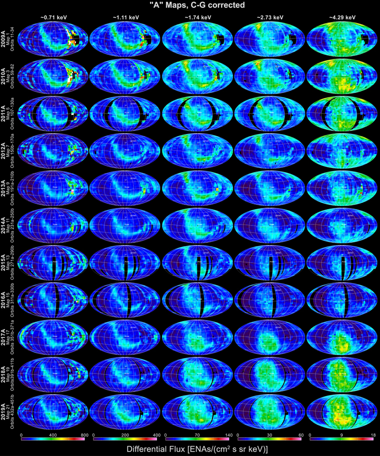
Figure 3. IBEX ENA A maps as in Figure 1, but C–G corrected into the heliospheric reference frame.
Download figure:
Standard image High-resolution image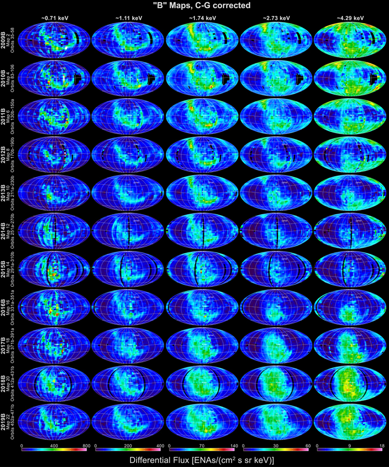
Figure 4. Same as for Figure 3, but for the second half-year (B) ENA maps.
Download figure:
Standard image High-resolution imageFigure 5 shows maps that statistically combine all 11 yr of C–G-corrected IBEX data (2009–2019). Because there are significant temporal variations in the actual ENA fluxes over this time, such very long integrations only provide an “average” view of the heliosphere’s interstellar interaction as observed at 1 au in the heliospheric reference frame.
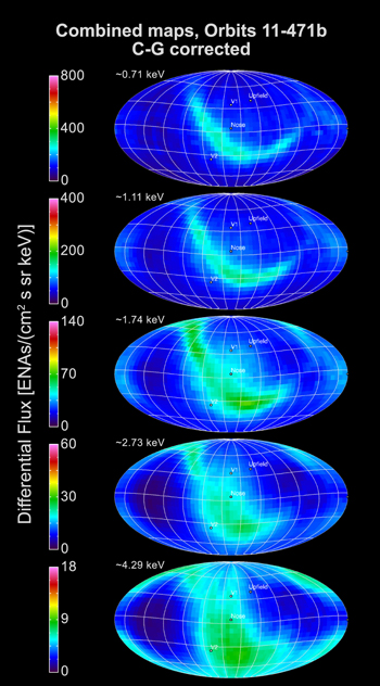
Figure 5. Combined ENA fluxes in the heliospheric reference frame over the years from 2009 to 2019. Fluxes are averaged, including statistical uncertainties, on a pixel-by-pixel basis with no additional smoothing. The upwind (nose) direction, Voyager 1 direction, Voyager 2 direction, and upfield directions (from Dayeh et al. 2019) indicated by the central, north, south, and north-starboard dots, respectively, are easier to see in these panels than the previous figures.
Download figure:
Standard image High-resolution imageIn this study, we again provide ENA maps corrected for ENA flux modifications due to radiation pressure effects and ionization losses en route from the outer heliosphere to their measurement at 1 au. We follow the same approach as in our prior studies (McComas et al. 2012, 2014a, 2017) and use observations of the time-variable solar UV and solar wind to produce ENA flux corrections that are both energy and heliolatitude dependent. The physics and principles of the survival probabilities of heliospheric ENAs were presented by Bzowski (2008) and Bzowski et al. (2013a, 2013b). Here, in Appendix B, we document the orbit-by-orbit survival probabilities used in this study, as well as other details of the survival probability calculations and their uncertainties.
As an illustrative example, Figure 6 shows the calculated survival probabilities for the north and south polar pixels for each of the IBEX-Hi energy steps. The survival probabilities were larger in the early and most recent parts of the mission, when solar activity was low, and smallest around the middle of the mission, at times around solar maximum. Correcting for survival probabilities is important, especially in the lower energy steps (labeled numbers), in order to understand the processes generating these fluxes in the outer heliosphere. We note that the values in this paper (blue) provide significantly better corrections to the data that are larger (lower survival probabilities) than used in McComas et al. (2017; red). This is largely because we were able to include several additional years of solar wind and UV data, but it also benefits from improvements in the modeling (Appendix B).
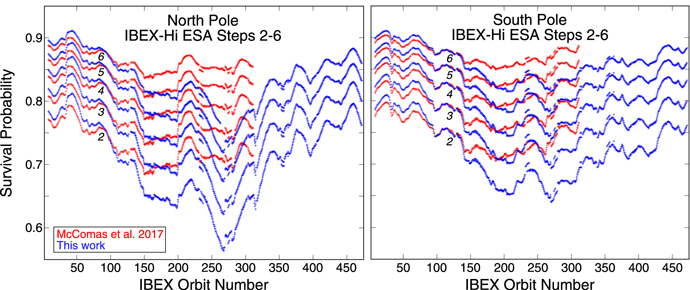
Figure 6. Survival probabilities for ENAs observed in IBEX’s northern (left) and southern (right) polar pixels. Curves for the different ESA steps (energies) are indicated by different number labels. The blue color indicates the probabilities calculated using the full model of the relevant factors based on presently available solar wind and solar EUV data (see Appendix B), and the red presents survival probabilities calculated earlier and used in our previous study (McComas et al. 2017).
Download figure:
Standard image High-resolution imageFigures 7 and 8 show the A and B IBEX maps, respectively, including both survival probability and C–G corrections. Figure 9 shows the survival probability and C–G-corrected combined maps for 2009–2019. These three figures are similar to Figures 3–5 but include survival probability, so they represent IBEX’s best knowledge of what the inward propagating ENA fluxes should be in the outer heliosphere (around the vicinity of the TS). These maps are intended for comparison to theories and models that do not account for ENA losses in transit in to 1 au.
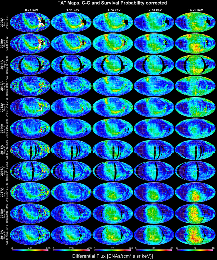
Figure 7. ENA A flux maps including survival probability and C–G corrections.
Download figure:
Standard image High-resolution image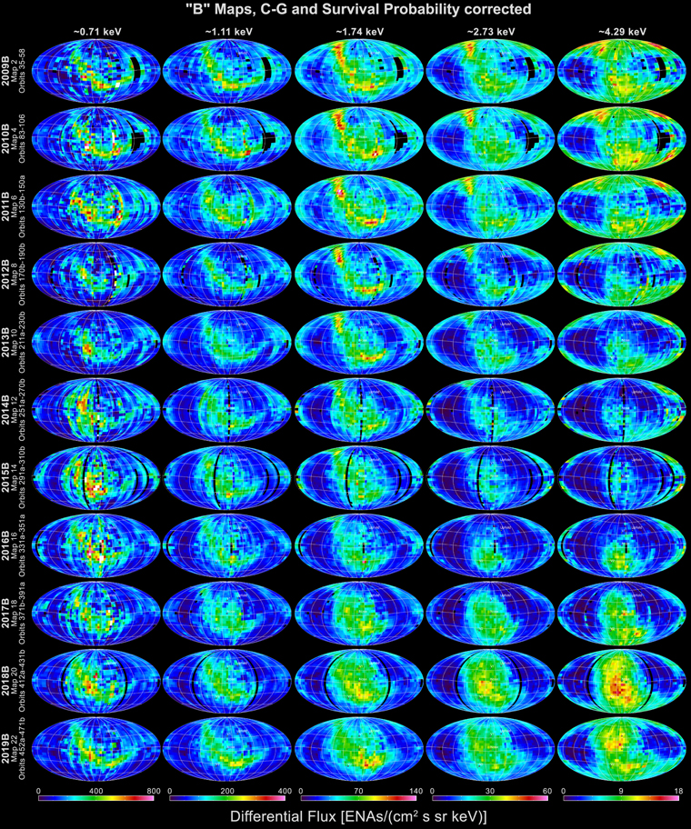
Figure 8. Similar to Figure 7, but for ENA B maps.
Download figure:
Standard image High-resolution image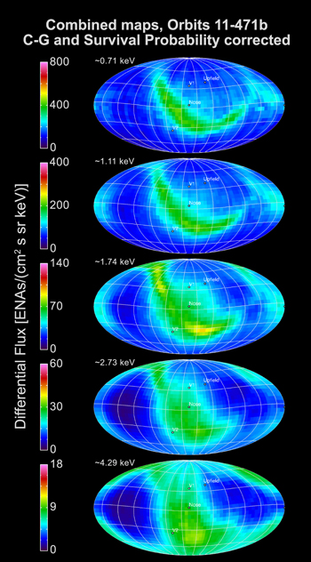
Figure 9. Combined survival probability and C–G-corrected maps for 2009–2019.
Download figure:
Standard image High-resolution image2.3. Ram and Anti-ram Sky Maps
All of the maps shown so far in this study use the six-month (A and B) maps or combine them through C–G corrections. In order to study detailed variations in the ENA fluxes over time, the IBEX team (McComas et al. 2012, 2014a, 2017) developed pairs of annual maps that combine all of the ram (spacecraft motion is ramming neutrals into the instrument apertures) and anti-ram (apertures are pointed where spacecraft motion is moving away from the neutrals). Even though different latitude observations represent slightly different energies, for the same spin-axis pointing, these ram and anti-ram maps sample exactly the same energy in each sky pixel each year. Thus, these maps are directly comparable from one year to the next, on a pixel-by-pixel basis, without requiring C–G corrections and the errors and uncertainties that they introduce.
Figures 10 and 11 show ram and anti-ram maps over 2009–2019, respectively; Figures 12 and 13 similarly provide the statistically combined 11 yr ram and anti-ram maps. Importantly, these maps all include the survival probability corrections so that they represent real changes in ENA fluxes coming in for the outer heliosphere and not the variable ionization and loss mechanisms that occur in transit.
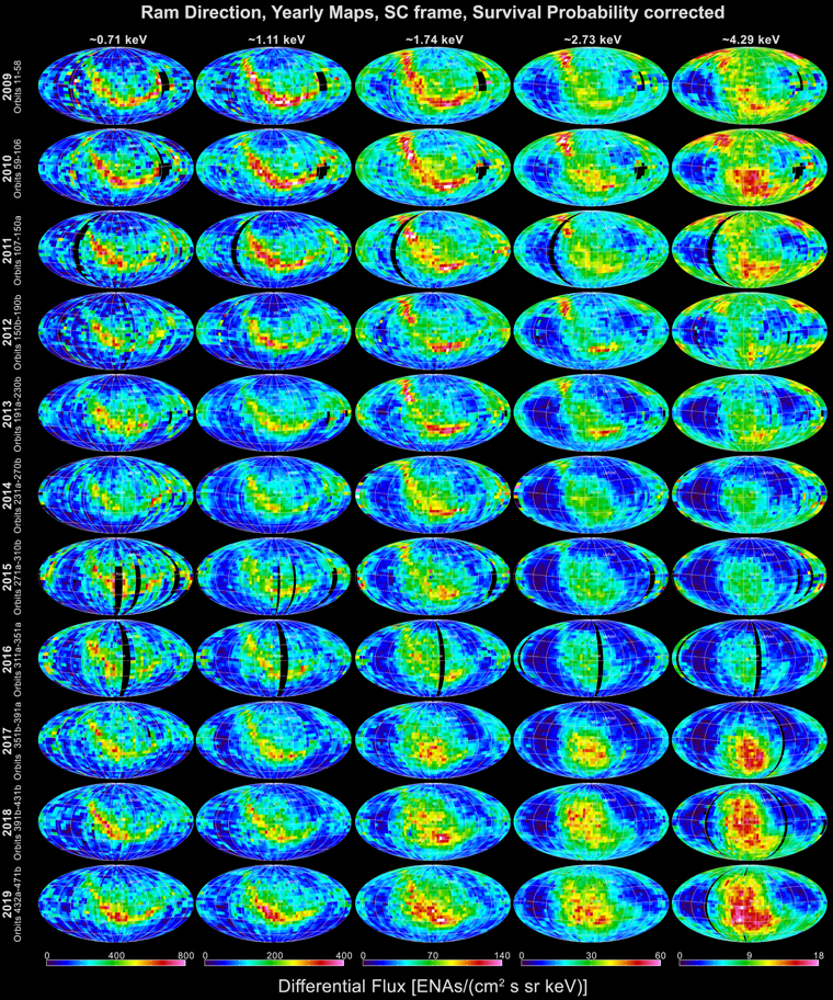
Figure 10. Annual “ram” maps for 2009–2019, corrected for ENA survival probability.
Download figure:
Standard image High-resolution image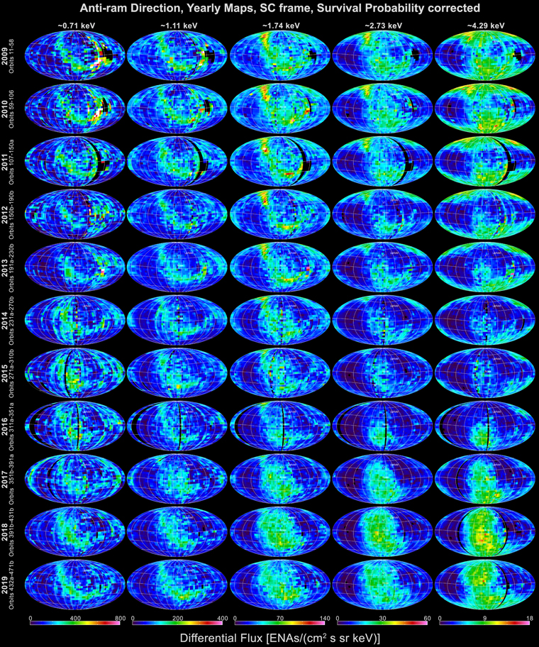
Figure 11. Similar to Figure 10, but for “anti-ram” observations.
Download figure:
Standard image High-resolution image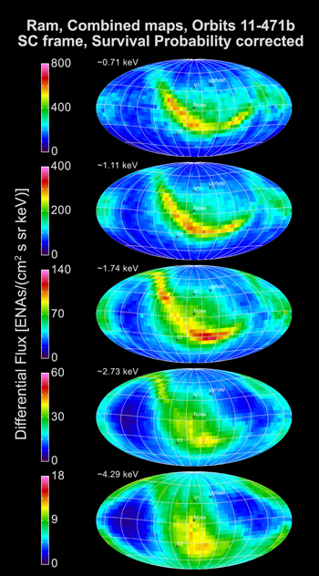
Figure 12. Ram maps produced by statistically combining all 11 annual ram maps (2009–2019) at each energy from Figure 10.
Download figure:
Standard image High-resolution image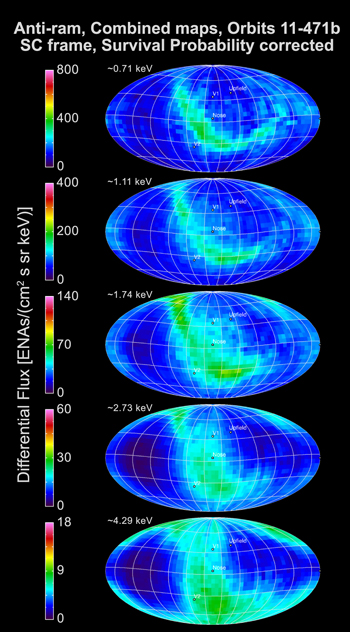
Figure 13. Similar to Figure 12, but anti-ram maps.
Download figure:
Standard image High-resolution image2.4. Spectral Index Maps
In contrast to the various single-energy sky maps shown above, maps of the spectral indices combine information about the relative fluxes of various energy ENAs on a pixel-by-pixel basis. Figure 14 shows spectral indices calculated by a power-law fit to the measured ENA fluxes to energy in the top five IBEX-Hi energy steps, separately for each year and for ram (left) and anti-ram (right) maps. As in McComas et al. (2014a, 2017), these maps are in the spacecraft reference frame and do not include the more complicated (and model dependent) C–G corrections. Figure 15 shows the same spectral index maps including the survival probability corrections.
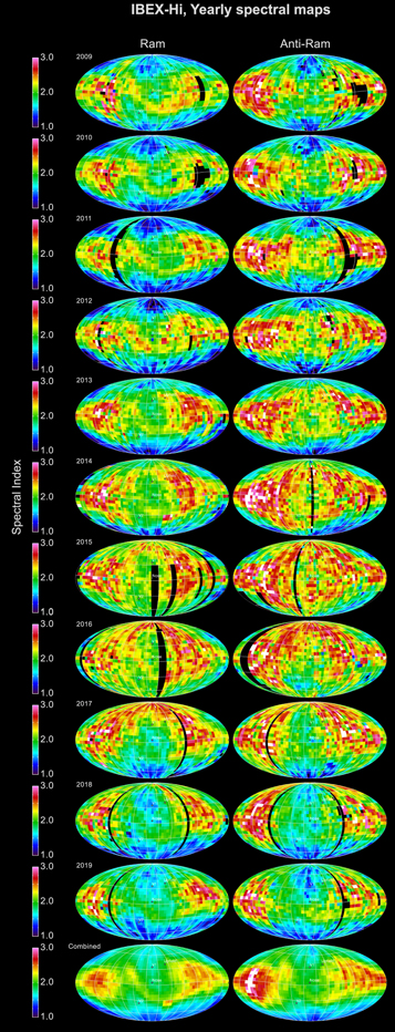
Figure 14. Ram and anti-ram sky maps of energy average spectral index over IBEX-Hi energy range (∼0.5–6 keV) in the spacecraft reference frame. Data from 2009 through 2019 are shown in the top 11 rows, while the bottom row provides spectral indices statistically averaged over all years.
Download figure:
Standard image High-resolution image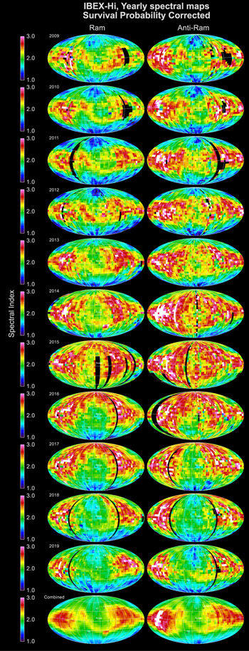
Figure 15. Same as Figure 14, but corrected for survival probability.
Download figure:
Standard image High-resolution imageFigures 14 and 15 show several global features in the spectral indices. In general, low- to midlatitudes have characteristically larger spectral indices for the first several years of IBEX observations. These larger indices broaden to higher/all latitudes by ∼2015–2017 and then narrow back to low- and midlatitudes by 2019. McComas et al. (2017, pp. 12) argued that the earlier portion of these variations was “consistent with the breakdown of the large-scale circumpolar coronal holes that persisted through the prior solar minimum and the several year ‘recycle’ time for the solar wind to populate the inner heliosheath and Ribbon and propagate back into 1 au.” Now, with additional years of IBEX observations, we confirm this explanation by showing the return to a more solar minimum-like distribution in the global ENAs 2–4 yr after solar maximum, when the solar cycle is going through its declining phase and high-latitude polar coronal holes are re-forming.
The ENA emissions from the heliotail (McComas et al. 2013b), at the far left and right sides of these Mollweide projections, show the least variation over the full solar cycle. These authors identified the port and starboard lobes of the heliotail with very low fluxes at the two highest energies and, along with subsequent authors, identified regions of enhanced flux at low to mid energies coming from its northern and southern lobes (McComas et al. 2013b; Schwadron et al. 2014; Zirnstein et al. 2016a). As shown in Figures 14 and 15, the heliotail emissions include larger spectral indices in the low- to midlatitudes port and starboard lobes and smaller indices from the northern and southern lobes. We take up a more detailed discussion of the temporal variations of the global ENA emissions in Section 3 below. However, it is worth noting here that the smaller temporal variations seen in the downwind direction of the spectral index maps prove that the heliotail emissions sample longer lines of sight with a great mixture of various portions of the solar cycle and older on average solar wind outputs.
2.5. Maps Centered on Other Directions
All of the sky maps shown so far in this study are centered on the upwind direction. While using this standard format is best for most applications, other orientations can help bring out or highlight other aspects of the data, as shown in this section. The first alternate orientation we provide is rotated exactly 180° from the upwind direction—that is, downwind. Figure 16 shows Mollweide projections centered on this direction that combine data from all 11 years. Because they are centered on the downwind direction, these maps are excellent for examining the heliotail region of the heliosphere (McComas et al. 2013b).
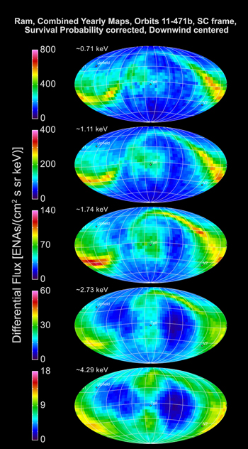
Figure 16. Same data as in Figure 12, but centered on the downwind (opposite) direction. The four lobes (north/south and port/starboard) of the heliotail are easily seen in this type of plot (McComas et al. 2013b).
Download figure:
Standard image High-resolution imageFigures 17 and 18 show Mollweide projections centered on the Ribbon (Dayeh et al. 2019) in the upwind and downwind hemispheres, respectively. The Ribbon center is consistent with the local external magnetic field in the VLISM (McComas et al. 2009b; Schwadron et al. 2009). Zirnstein et al. (2016b) used an MHD model to include the draping of the interstellar magnetic field around the heliopause and, assuming a secondary ENA source for the Ribbon, determined the pristine interstellar magnetic field magnitude and direction, ∼(227°, 35°). Because Ribbon ENAs originate largely from the nearest, draped regions of the interstellar magnetic field, the center of the Ribbon is shifted ∼8° toward the VLISM inflow direction along the B–V plane (Zirnstein et al. 2016b).
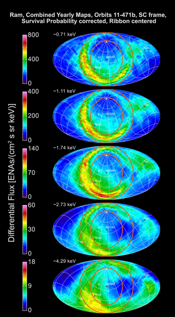
Figure 17. Mollweide projection of the 11 yr combined ENA fluxes centered on the Ribbon: ecliptic J2000 (21833, 4038) from Dayeh et al. (2019). The ecliptic plane (curved line) and circles are included to guide the eye.
Download figure:
Standard image High-resolution image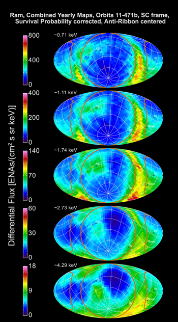
Figure 18. Similar to Figure 17, but centered downwind along the field—antiparallel to the Ribbon center. The ecliptic plane and lines indicating the approximate boundary of the Ribbon are the same as in that figure.
Download figure:
Standard image High-resolution imageFigure 19 shows the 11 yr averaged ram data rebinned into pixels in galactic coordinates. For this figure, we include survival probability corrections. In this projection, the maps are seen from a Sun-centered observer with the galactic center in the center of the Mollweide projections.
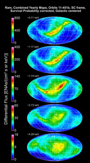
Figure 19. Mollweide projection of 11 yr combined ENA fluxes in galactic coordinates. Raw IBEX data were binned directly into the pixels in galactic coordinates for these maps, so no interpolation of the data was required. As in the other plots, the black dots indicate, from top to bottom, the directions of Voyager 1, upwind, and Voyager 2, respectively.
Download figure:
Standard image High-resolution imageFigure 20 provides yearly averaged ram maps in equatorial J2000 coordinates. ENA fluxes have been corrected for survival probability. This projection is similar to the standard IBEX maps but has been rotated so that the north pole points parallel to Earth’s rotation axis and the plot is centered on the vernal equinox.
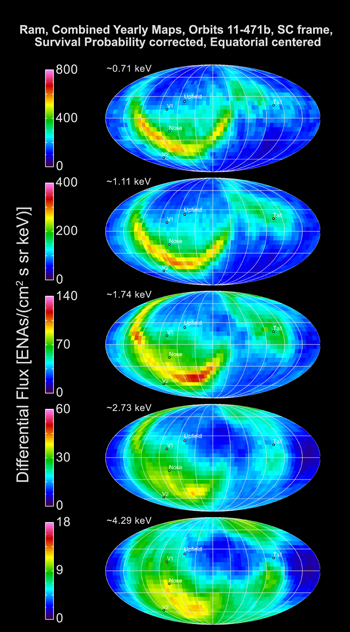
Figure 20. Mollweide projection of the 11 yr combined ram map data in equatorial J2000 coordinates. Similar to Figure 19, the raw IBEX data were binned directly into pixels in equatorial coordinates.
Download figure:
Standard image High-resolution image3. Time Variations over a Solar Cycle of IBEX Observations
IBEX has observed temporal variations in the ENA fluxes from the outer heliosphere throughout the mission. Tracking this evolution over time provides considerable additional information about the structure and physical processes throughout the outer heliosphere and its interaction with the VLISM. In this section, we extend and examine the data over the full 11 yr of IBEX observations for the first time and expand upon prior analyses of these critical time variations. We do this through a combination of two complementary approaches.
One approach provides overview data products of temporal variations from one full year to the next, as we did in our prior global update papers (McComas et al. 2012, 2014a, 2017). For these, we follow the same general principles used in the previous update papers: (1) using ENA fluxes that include their energy- and time-dependent survival probabilities from the outer heliosphere, (2) avoiding C–G corrections and the additional errors and uncertainties they introduce, and (3) showing time variations separately in ram maps and anti-ram maps so that each pixel represents exactly the same viewing geometry from one year to the next. These plots and data products have the advantage of direct comparison of different years’ data, but only at annual cadence.
The other approach allows us to capture the rapidly changing evolution of the outer heliosphere at a six-month time resolution rather than a one-year cadence. For these analyses, we utilize ram and anti-ram maps together, including both C–G corrections and survival probabilities, as we did in McComas et al. (2018a, 2019a). This sort of analysis requires extra care to ensure the correct physical interpretation. We discuss and directly address these issues in association with these combined figures below.
Figure 21 shows the “big picture” of time variations over the IBEX mission and combines all 11 annual ram maps (2009–2019) of IBEX’s highest energy ENAs (∼4.3 keV) with the time variations of smoothed sunspot number (red) and solar wind dynamic pressure observed at 1 au (white). The ENA fluxes at this energy represent essentially three different epochs. From 2009 to 2014, ENA fluxes progressively decreased from nearly all portions of the sky. From 2014 to 2016, these fluxes stayed relatively steady, changing little from the low levels they had reached by 2014. Finally, from 2016 to 2019 the ENA emissions increased dramatically in the upwind hemisphere. McComas et al. (2017) demonstrated that the first two of these intervals could be explained by the overall decline in the solar wind output until ∼2010 and flattening at lower levels from then until ∼2014, with an appropriate ∼2–4 yr delay for recycling solar wind ions into ENAs on the upwind side of the heliosheath.
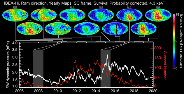
Figure 21. Survival-probability-corrected ram maps of IBEX 4.3 keV ENAs (top) compared to the time series of the smoothed sunspot number (bottom, red) and solar wind dynamic pressure at 1 au (bottom, white). The higher density solar wind at faster speeds also incorporates more pickup ions through enhanced charge exchange, and it is these ions that get energized at the TS and come back as the ∼4.3 keV ENAs. Shading and connecting lines indicate typical ∼2–3 yr time delays for the solar wind that incorporates pickup ions “recycled” back as ENAs at these high energies from the nearest portion of the TS and heliopause ∼20° south of the nose.
Download figure:
Standard image High-resolution imageMcComas et al. (2017) also first pointed out the large and persistent increase in solar wind dynamic pressure observed at 1 au in the second half of 2014 and predicted that significantly higher ENA fluxes would be returning from south of the upwind direction soon thereafter. A small increase started at the predicted closest location of the TS to the Sun in late 2016 (McComas et al. 2018b), becoming the substantial increase in ENA flux seen in 2017. Over 2018 and 2019, this enhancement progressed in a very organized and logical spatial/temporal way from there. Specifically, the ENA intensification started ∼20° south of the upwind direction, which is the closest region of the TS and heliosheath as demonstrated by McComas & Schwadron (2014). Those authors explained the unexpected flow direction measured by Voyager 2 in the heliosheath (Richardson & Decker 2014), based on the IBEX understanding of the compression of the heliosphere by asymmetric draping of the VLISM magnetic field. After the initial increase ∼20° south of the upwind direction, this enhancement expanded outward from there through progressively farther locations in the heliosheath (McComas et al. 2018b, 2019a).
Figure 21 extends the evolution, showing how the enhanced solar wind output progressively filled the upwind hemisphere and expanded over the poles during the past three years. In addition, this figure shows that the solar wind output (dynamic pressure, white line) varied after the pressure enhancement. This curve suggests a quasiperiodic variation with period of about a year and more importantly, a general decline from 2017 through 2019. This is important because the nearer portions of the heliospheric boundaries are now beginning to respond to the time-variable reduction in the prior strong increase and thus may start to display somewhat lower ENA emissions, following the same spatial/temporal spreading as the enhancement but with a time delay of a few years.
We now turn to a more detailed examination of this recent evolution of the heliosphere in response to the 2014 solar wind pressure enhancement. Because of the rapid evolution of ENA fluxes in response to this, starting initially in anti-ram maps in late 2016, we follow McComas et al. (2018b, 2019a) in using both the ram and anti-ram observations together to get the highest possible time resolution from IBEX. Figure 22 shows the four highest energy ENA observations for 2015 through 2019. Because of the IBEX pointing and mission design (McComas et al. 2009a), ram maps collect ENAs from the upwind direction over the first half of each year and anti-ram maps from the upwind direction over the second half. Thus, in Figure 22, we align the locations of the various maps with this timing, but remind the reader that these are not snapshots in time and that there is considerable evolution over each year plotted.
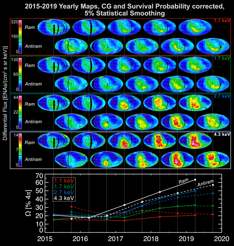
Figure 22. Ram and anti-ram ENA flux maps for ∼1.1 keV (red), ∼1.7 keV (green), ∼2.7 keV (blue), and ∼4.3 keV (white) for 2015 through 2019. All Mollweide projection maps in this figure are centered on the upwind direction, as used throughout most of this study. The bottom panel of the figure shows the fraction of the full sky (4π sr) with ENA emissions above one-third of the top values of each respective color bar. While there are differences between the ram (solid lines) and anti-ram (dashed lines) map quantitative values, the trends and timing are fully consistent between the two.
Download figure:
Standard image High-resolution imageThe ENA fluxes displayed in Figure 22 clearly evolve in a progressive pattern over time. This evolution is directly relatable to the outer heliospheric size, shape, and structure in a remarkably straightforward way. The large-scale response begins with enhanced emissions south of the upwind direction, first seen in the late 2016 anti-ram map in the 4.3 keV energy band. The TS and heliopause are closest to the Sun in this direction owing to the magnetic compression of the draped interstellar magnetic field around the heliopause (McComas & Schwadron 2014; McComas et al. 2019b). Over time, the enhanced emissions spread out from there, progressively covering higher and lower latitudes and broadening in longitude.
At the same time, enhanced emissions begin and then progressively expand next in the ∼2.7 keV energy band and then at ∼1.7 keV. This is consistent with both a longer return time for slower, lower energy ENAs and additional delays in the production of lower energy ENAs seen in prior simulation results, likely due to the increase of heliosheath plasma pressure over time and its energy-dependent effect on ENA production (McComas et al. 2018b; Zirnstein et al. 2018b). Finally, the ENA emissions in 2019 at the two highest energy bands near the upwind direction and south of the nose are reduced compared to 2018, consistent with the reduction in dynamic pressure from the Sun starting back in 2017, as shown in Figure 21.
The bottom portion of Figure 22 shows the time evolution of the fraction of the full sky that reaches one-third of the full-scale color bar (set to bound the maximum values) for each energy band. These results quantify the orderly progression described above and indicate that by 2019, the ∼2.7 keV ENAs have filled half of the sky at this level and the ∼4.3 keV ENAs have greatly exceeded it. These results are qualitatively similar to expectations from earlier numerical simulations of this pressure pulse (McComas et al. 2018b; Zirnstein et al. 2018b), as shown in Figure 23.
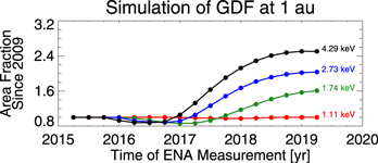
Figure 23. Simulation results following McComas et al. (2018b) and Zirnstein et al. (2018b) for the fraction of the sky relative to that fractional coverage in 2009, with emissions above the same relative values as in the bottom graph in Figure 22.
Download figure:
Standard image High-resolution imageFigure 24 provides an alternate way of plotting the ∼4.3 keV ENA fluxes where each swath of the sky (vertical stripe) aligns precisely with the time that it was taken (abscissa, bottom). This format is especially good for showing the progressive expansion of the emissions and transition from the upwind hemisphere, across the polar regions and over into the high-latitude portions of the downwind side. The top panel is all ram map data and the bottom anti-ram, which generally exhibits slightly lower fluxes for the same features, as described above. In this format, the upwind (nose, N) hemisphere alternates between the top and bottom panels as indicated by the red rectangles and arrows (similarly, the downwind (tail, T) panels alternate across the arrows). By focusing on the nose (or tail) panels, we are able to follow the sequential time evolution from one swath of measurements to the next.
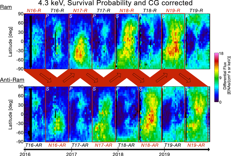
Figure 24. Mapping of the 4.3 keV ENAs in a “rectangular” format that aligns the precise timing when each swath of data (vertical stripe) was taken. This format also makes it easy to see the progression of the response to the expanding pressure front to and beyond the port (P) and starboard (S) flanks and over the poles. The top panel is all ram data, while the bottom is all anti-ram. As IBEX repoints every four to five days, the portion of the sky viewed is also rotated 4°–5° in longitude in order to maintain IBEX’s Sun-pointed spin axis. In this format, the upwind (nose) hemisphere swaps back and forth between the top and bottom panels as indicated by the red “zig-zag” arrows in the middle.
Download figure:
Standard image High-resolution imageThe changes over time in Figure 24 demonstrate a clear and consistent progression. ENA emissions in N16-AR (nose hemisphere from the anti-ram direction taken in the second half of 2016) increase over a small region centered south of the upwind direction, as expected for the closest region of the TS and heliopause. The ENA enhancement expands from there in both latitude and longitude in N17-R, and by N17-AR the enhancement has reached the south pole and started to spill over into the anti-ram hemisphere at high southern latitudes as seen in T18-AR. At the same time, in N18-R, we see the continued expansion northward and broadening to both sides in longitude. By N18-AR, the enhanced emissions have reached the north pole and expanded significantly farther onto the downwind side in the south (T18-AR and T19-AR). In N19-R and N19-AR, this expansion continues to fill nearly all of the upwind hemisphere and extends substantially over both poles and around the high-latitude flanks into the downwind side (T18-R, T19-AR, and T19-R).
The fact that the enhanced emissions cross the south polar region about a year earlier than the north is consistent with a significant north–south asymmetry produced by the magnetic pressure of the local interstellar magnetic field draped preferentially around the southern side of the heliosphere (McComas et al. 2009a, 2019b; McComas & Schwadron 2014). This asymmetry has also been found through cross-correlation analysis between north and south polar solar wind properties and time-lagged returning ENAs (Reisenfeld et al. 2012, 2016).
One effect shown in Figure 24 that is not clear in the other data formats used in this paper is how the progressive sampling of the sky by repointing the IBEX spin axis over the year produces an apparent longitudinal asymmetry in time-variable ENA emissions. In particular, at the start of each year, the ram map sampling starts at the starboard (S) edge of each map and that of anti-ram at the port (P) edge. Both build up sequential swaths moving to the right with time from there, so the ram maps sample across the upwind hemisphere from starboard to port and the anti-ram across the downwind hemisphere from port to starboard.
McComas et al. (2019a) explicitly showed this sampling effect and quantified the amount of apparent asymmetry it produced for the early expansion of the region of enhanced ENA emissions in 2017 and early 2018. For an expanding region, as has occurred for the past few years, the sampling produces a shift of enhanced ENA emissions to the right in Figure 24 (see, for example, T18-AR through T19-R, where the southern pole fluxes expand to lower latitudes in the downwind side later in time due to the sampling effect). For regular outward-viewing Mollweide projections used for most IBEX sky maps, this shift is opposite—to the left—as swaths are added from right to left.
The plotting format shown in Figure 24 strongly overemphasizes the high-latitude regions, just as in similar “Mercator” maps of Earth the continent of Antarctica covers the entire bottom of the map. Thus, in Figure 25, we provide an alternate format of the ram-only data plotted in hemispheres centered on the upwind (top row) and downwind (bottom row) directions. In this format, it is easy to see the expansion of enhanced fluxes beyond the high-latitude terminator and extending over the south pole and high southern latitudes starting in late 2017. This expansion continues in the south through 2018 and 2019 and follow in the north by about a year.
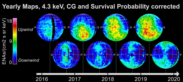
Figure 25. Upwind (top) and downwind (bottom) hemispheres of ∼4.3 keV ram map data, including C–G and survival probability corrections. The upwind hemisphere shows the progressive expansion of the solar wind enhancement from the Sun in late 2014, starting at the closest region of the heliosheath and progressing to increasingly distant regions. In contrast, the downwind hemisphere shows that the north/south and port/starboard tail lobes are comparatively very stable. Some enhancements start propagating past the terminator around the southern and then northern poles and high-latitude flanks as expected for a heliosphere where the TS and heliopause are much closer on the upwind side than the downwind.
Download figure:
Standard image High-resolution imageThroughout the progression in Figures 24 and 25, it is clear how the region of enhanced ENA emissions spread out over time from the closest portion of the TS and heliopause south of the nose and progressively covered more and more of the sky. This progression first exposes the directions where the TS and heliopause are closest and progressively farther away from there over time. In addition, we see the largest spillover from the upwind to downwind hemisphere is over the starboard side of the south pole and later is somewhat less over port side of the north pole.
For the sampling bias described above, we would expect both poles to behave similarly, with an emission region that grows preferentially over the starboard side near both the north and south poles with time. This discrepancy is explainable by the magnetic field line tension force of the external field geometry discovered by IBEX “squeezing” the heliosphere along the general direction of the external magnetic field. This causes the heliopause and ultimately the TS to be compressed more on the port side of the north pole and starboard side of the south pole (see McComas et al. 2009b and cover of that issue of Science). This asymmetric magnetic compression has also been shown to cause an overall tilt of the heliotail in IBEX observations (McComas et al. 2013b) and simulations (e.g., Heerikhuisen et al. 2014). This effect, along with IBEX’s temporal sampling effect that makes expanding features appear to move to the starboard, seems consistent with the different offsets observed in the northern and southern polar regions. Interestingly, McComas et al. (2019b) also found an offset of the TS based on the Voyager 1 and 2 observations of the magnetic disconnection from the TS, in the direction similar to that found in this study.
In addition, for Figures 24 and 25, we note that the more distant regions of the heliosheath produce smaller increases in ENA fluxes over time, compared to the initial increase occurring ∼20° below the nose, with the color coding of these figures moving from red to yellow to green. There are at least a couple of contributing reasons for this diminution. First, the solar wind has expanded more, and therefore, the dynamic pressure is less by the time it reaches more distant portions of the TS. Second, there is a longer radial path length through the heliosheath to the heliopause, and therefore, it becomes less pressurized and the enhancement represents a smaller fraction of the total.
The ENA fluxes at low latitudes in the upwind hemisphere also progressively spread out in longitude over 2017–2019. Even though such emissions crossed over the poles and into the downwind hemisphere in 2018 (south pole) and 2019 (north pole), they have not yet extended all the way to the low-latitude port and starboard terminators. This could be interpreted as the distance being greater from the Sun to the low-latitude terminators than to the poles, which would indicate a north–south compressed heliosphere. However, because we have had solar minimum conditions for the past roughly half-decade, it is not that simple. Around solar minimum, the solar wind at mid- to high latitudes has been nearly twice as fast as the slower, low-latitude wind, so the pressure enhancement travels outward roughly twice as fast. In addition, faster solar wind produces a hotter plasma in the heliosheath and thus a faster wave speed, which should lead to faster inflation of this region and an earlier enhancement of ENA emissions.
The other region that was still unaffected at least through 2019 is the heliotail (McComas et al. 2013b; Zirnstein et al. 2017). In all of the figures showing 4.3 keV ENAs, we see the port and starboard tail lobes as the very low flux regions to the sides of the downwind direction and the north and south tail lobes of slightly enhanced flux above and below it. The port and starboard tail lobes and the low-latitude (<30°) portion of the central tail region between them are fed by the slow solar wind, just like the low- to midlatitude regions on the upwind side. The fact that the ENA emissions in these regions remain largely unchanged proves that the ENA-emitting regions down the tail are significantly farther from the Sun than toward the nose. We take up this topic in more detail in the Discussion section below.
For completeness, we now return to comparing whole-sky, non-C–G-corrected annual maps as in our earlier update papers. Figure 26 uses definitions of subregions of the sky similar to those in McComas et al. (2017) to show general temporal trends for each of nine regions. Each represents a different part of the outer heliospheric interaction, although fluxes from some of the features can be seen in multiple regions, making it harder to uniquely isolate some of the responses. All fluxes have been normalized to the 2009 average values for that region, and we include survival probability corrections for time-dependent losses of ENAs on their transit from the outer heliosphere in to 1 au.
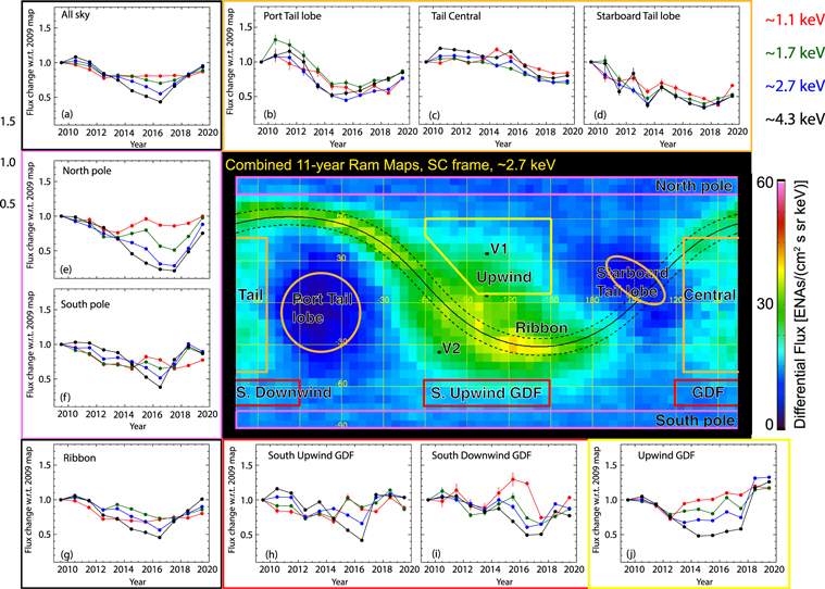
Figure 26. Combined 11 yr, 2.7 keV, ram map with nine regions identified for temporal analysis. The surrounding panels show the year-by-year temporal variations for the average ENA fluxes normalized to the 2009 fluxes for each region at all energies, along with an average over the whole sky (upper left). The energy passbands are color coded (upper left). We include statistical error bars; however, there may be additional systematic errors, especially at lower energies.
Download figure:
Standard image High-resolution imageThe time variations shown in Figure 26 are complicated and arise from spatially structured time variations within each of the regions. Thus, for this figure, we focus only on the large-scale temporal variations and the relatively simpler story that they tell. The trend for the full sky (upper left) shows a general decrease for the first half of the IBEX mission, flattening out in 2015–2017, and increases in the last two years. This basic sequence is consistent with the solar wind output and a few year delay to recycle the solar wind and embedded pickup ions as shown in Figure 21 and described above. We note that in the all-sky panel, as well as other more limited regions, the relative variations both downward and then back up are greatest for the highest energy ENAs and are reduced for each progressive lower energy step, as seen in Figure 23 above.
In the south upwind GDF (at mid to high southerly latitudes), we see a general reduction through 2016 at most energies and then an upturn in flux progressively from the highest energies down, owing to the pressure enhancement that passed 1 au in late 2014. A year later, a similar upturn occurs in the upwind (northern hemisphere) and south downwind GDF. The polar regions (middle left) generally show a continuing reduction at high energies because of the last solar maximum disappearance of fast solar wind at the poles (Reisenfeld et al. 2016). After that, the upturns are similar to the high-latitude GDF, again with the southern pole preceding the north by about a year. All of this makes a consistent picture, based on the propagation of the pressure pulse through the outer heliosphere described by McComas et al. (2018b, 2019a) and extended and discussed in more detail above. Moreover, the evolution of ENA fluxes from the northern and southern poles are also consistent with the fast solar wind emitted from the evolving polar coronal holes (Reisenfeld et al. 2019; Zirnstein et al. 2020a).
Turning to the heliotail, the port and starboard tail lobes and the larger region identified as the “central tail” here (top) all show much smoother and slowly changing behavior that represent much longer integration times and depths down the heliotail from a distant TS out to the cooling length (Schwadron et al. 2014; Zirnstein et al. 2016a; Schwadron & Bzowski 2018) several hundred au even farther back. The general minima appear around 2015 in the port lobe, 2017 in the starboard lobe, and may just be reached in 2019 in the central tail. One additional note of caution is that in 2019, the enhanced fluxes that expanded past the north and south poles are beginning to encroach on the broad tail regions used in Figure 26, so some of the latest turnup may be due to “spillover” from these other regions.
For the simplified analysis shown in Figure 26, we use a very narrow central swath of the Ribbon of ±6° in order to try to minimize the GDF’s contribution to it. However, with the large increase in GDF flux across the entire upwind side, there is still a significant contribution in what otherwise would be largely Ribbon flux. This contribution from the GDF can be seen as an upturn in 2018 and 2019 in the two highest energy fluxes. It is interesting that even with this superposed contribution, the Ribbon ENAs at the dominant energy of ∼1.1 keV (∼400 km s−1) are still essentially flat when summed across the whole Ribbon structure. A separate analysis of the temporal variation of Ribbon fluxes is provided below.
Another analysis performed by McComas et al. (2017) is based on differencing annual ram maps for various combinations of years. Figure 27 shows flux difference maps for all five IBEX-Hi energies and for five different combinations of years. The rows progress downward from the earliest to latest times over the IBEX mission. Finally, the bottom row shows the latest two years (2018–2019) minus the earliest three (2009–2011).
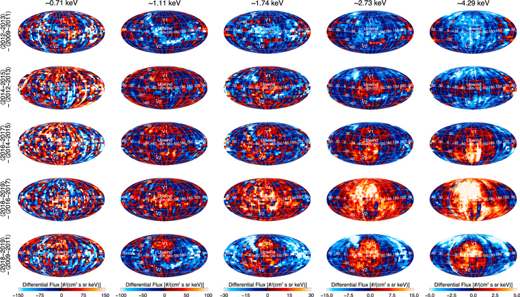
Figure 27. Differences in survival-probability-corrected ENA fluxes for various energies averaged over different groups of years. These observations have been binned over time to increase the statistical certainty prior to differencing. From top to bottom, the rows represent 2012/13–2009/10/11, 2014/15–2012/13, 2016/17–2014/15, 2018/19–2016/17, and 2018/19–2009/10/11. The higher energy plots clearly show the pressure pulse GDF expansion.
Download figure:
Standard image High-resolution imageDifferences in absolute flux intensities shown in Figure 27 are especially good for identifying features that have temporal variations different from other portions of the sky. McComas et al. (2017) used an earlier version of this type of plot to argue that the Ribbon has to be from a different and more time delayed source than the GDF, which was likely a secondary Ribbon source process in the VLISM, just outside the heliopause. This delay in the change in the Ribbon flux is especially evident in the top and bottom plots of the ∼1.1 keV ENAs, which show a deficit of flux in the Ribbon location at later times compared to earlier ones (blue)—that is, the Ribbon is dimming while the surrounding GDF is stable or increasing.
Another interesting feature in the Ribbon is the evolution of the “knot” of enhanced emissions at higher northern latitudes at higher energies (McComas et al. 2010, 2012). In this analysis, we see the dimming of the knot moving to higher latitudes over time (upper-left portions in the top three rows) in the ∼1.7, 2.3, and 4.3 keV ENA channels. These reductions are driven by the loss of the northern polar coronal hole around solar minimum, which occurred roughly a half solar cycle before these observations. This long delay is again consistent with a secondary ENA source for the higher latitude Ribbon knot seen early in the IBEX mission.
McComas et al. (2017) argued that the source locations, and in fact generation processes, of the ENAs in the Ribbon and GDF must be quite different, with the Ribbon source both farther away from the Sun and time delayed compared to the GDF. The new data from the last few years, and especially 2019, strongly support the assertion that the Ribbon comes from a secondary ENA source. Figure 28 shows this in difference maps of ∼1.1 keV ENAs from 2016 to 2019.
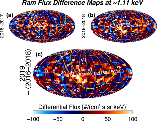
Figure 28. Differences of survival-probability-corrected ENA ram maps at ∼1.1 keV for (a) 2018–2017 and (b) 2019–2018. Panel (c) provides improved statistics for the differencing by comparing 2019 to the average of 2016–2018. The contours in yellow track a 20° wide path of the Ribbon at these energies from Dayeh et al. (2019). ENA fluxes are clearly enhanced in 2019 in the closest portion of the Ribbon near the upwind direction compared to prior years.
Download figure:
Standard image High-resolution imageThe newly brightened pixels near the upwind direction and within the Ribbon curves in Figure 28 provide the first measurements that demonstrate the possible reemergence of the IBEX Ribbon after the solar wind enhancement that began in the second half of 2014. The timing of this reemergence is exactly that expected for a secondary Ribbon source. At ∼1 keV (440 km s−1), solar wind protons, their neutralized hydrogen atoms, and returning ENAs all travel nearly 100 au per year. For a secondary source with the nearest emission regions just beyond the heliopause at ∼150 au from the Sun, this gives a ∼3 yr round-trip transit time. We need to add to this a ∼2 yr typical delay for the time it takes an ion that came from the neutralized solar wind to reneutralize and escape back as a secondary ENA (e.g., Florinski et al. 2010). Combined, this gives a total of ∼5 yr, with some initial emissions arriving ahead of this as the reneutralization process produces a statistical distribution over time. Thus, the first brightening of the Ribbon matches perfectly with the time between the Sun’s enhanced output in the second half of 2014 and the first returning ENAs in the first half of 2019, a time of approximately four and a half years. This reemergence was also predicted by a recent time-dependent model of the Ribbon in the same direction of the sky (Zirnstein et al. 2020c).
4. Discussion and the Future
In this study, we have examined IBEX’s global ENA observations over a full solar activity cycle (Solar Cycle 24), covering the 11 yr from 2009 through 2019. In addition to providing and analyzing the last four years of observations as part of the whole mission data for the first time, we identified and implemented several improvements to the processing and analysis for the entire data set. This study documents the overall IBEX-Hi observations so that the community should be able to use the most current data readily and reliably. In addition, we have been optimizing the IBEX data processing, with smaller and smaller corrections and improvements over the years. We now hope and intend that the ENA core processing methods and software used here are final and that future data releases will only include new IBEX observations and updated survival probability values, based on new solar wind and UV data. Thus, this study should be used by the community as the citable reference for all future IBEX observations and studies going forward.
With a full solar cycle of IBEX observations, we have significantly filled in our understanding of both the structure and temporal evolution of the outer heliosphere and its interaction with the VLISM. In particular, for the GDF and what it tells us about the overall shape and interaction of the heliosphere, from the most recent 2016–2019 observations we find:
- 1.Enhanced ENA emissions from the heliosheath expanded, covering an increasing fraction of the sky and encompassing regions starting with the closest portions of the TS and heliopause, ∼20° south of the upwind direction, and extending progressively away from there in all directions;
- 2.This expansion extended first to high southern latitudes and past the south pole into the downwind hemisphere in 2018, followed by a similar progression in the north about a year later, showing that the TS and heliopause are significantly closer in the south than the north;
- 3.Even though the enhanced emissions extended beyond both poles by 2019 and far beyond in the south, emissions from low latitudes at the port and starboard terminators did not show enhanced emissions. While this might indicate that the boundaries are farther away in these directions (i.e., that the heliosphere may be flattened in the north–south dimension), it is also possible that this is caused by the slower wind and wave speeds at low latitudes compared to those at high latitudes;
- 4.Emissions from the low- to midlatitudes in the downwind hemisphere have not yet increased, showing that the heliotail has not responded yet, and that it is much farther away than the heliosheath in the upwind direction or over the poles.
- 5.In addition to the boundaries being closer on the upwind compared to the downwind side of the heliosphere, the time sequence of IBEX ENA observations indicates a longer column depth of source plasma for ENAs in the downwind direction of the sky. This column depth grows with angle away from the closest point as the line of sight between the TS and heliopause increases; ultimately, it is limited by the cooling length, which is smaller for higher energies (e.g., Schwadron et al. 2011).
The temporal progression of the IBEX measurements strongly constrain the shape of the heliosphere and show that notions that the heliosphere is anything like a “round” bubble with the Sun at the middle (e.g., Dialynas et al. 2017) is not supported by the data and, simply, cannot be right. A recent study by Schwadron & Bzowski (2018), entitled “The Heliosphere Is Not Round,” already demonstrated that the measurements from the Ion and Neutral Camera (INCA) on the Cassini spacecraft at Saturn did not require such a geometry and could be well explained by episodic heating and cooling of the heliosheath plasma during periods of large-scale compression and expansion. Finally, the spectrum of ENAs observed by IBEX, INCA, and HSTOF over an energy range from ∼3 to ∼88 keV was recently shown to be consistent with the classical paradigm of the heliosphere, with an extended tail (Czechowski et al. 2020).
In the current study, we do not address the INCA claims but instead simply point to the indisputable progression of IBEX observations in response to the large and continuous solar wind output (dynamic pressure enhancement) from the Sun that began in late 2014. Figure 29 provides a graphical summary of these IBEX results in a meridional plane that includes the upwind/downwind axis and solar north and south poles. The interpretation of the IBEX data could not be clearer: the 2014 pressure pulse first reached, compressed, and generated enhanced ENA fluxes from the nearest part of the heliosheath ∼20° south of the upwind direction. After that, the pressure enhancement reached increasingly more distant southern and later northern portions of the heliosheath, which responded with increased ENA emissions illuminating these progressively more distant regions over and past the poles. As seen above, other regions, such as the heliotail and its four lobes still remain essentially unaffected through 2019, showing that they are even more distant and that the overall shape of the heliosphere has a highly compressed front and comparatively extended tail as anticipated by most heliospheric models.

Figure 29. Annual ram maps (top) and schematic diagrams of meridional cuts through the heliosphere (adapted from McComas & Schwadron 2014 and McComas et al. 2019a). ENA fluxes at ∼4.3 keV, including C–G and survival probability corrections and 5% statistical smoothing (McComas et al. 2019a), are color coded. For the bottom plots, data have been averaged over the five 6° swaths closest to inflow noon–midnight plane (orange lines). The 2016 fluxes show a general enhancement in the most compressed and closest direction of the heliosheath, ∼20° south of the upwind direction; this is similar to the distributions in prior years. The solar wind enhancement from late 2014 generated significantly increased ENA fluxes from the nearest region of the heliosheath in 2017. These enhanced emissions expanded across most of the upwind direction over the next two years, crossing past the south pole and into the downwind side at high latitudes by 2018 and similarly past the north pole by 2019.
Download figure:
Standard image High-resolution imageAs for the Ribbon, as shown in Figure 28, ENA emissions finally began to increase again in 2019 at typical slow solar wind energies (∼1 keV). This increase comes only from the closest region of the Ribbon at low southern latitudes and begins about two and a half years after the initial intensification of the GDF from the same direction (four and a half years since the late 2014 solar wind increase). This delay matches the expectations for a couple years of reionization time and additional travel time and very strongly supports the conclusion that a secondary ENA source is responsible for the IBEX Ribbon. With another year or two of IBEX data, it may be possible to finally prove this, but we will take this up in a follow-on study.
Given the long-term, quantitative observations of heliospheric ENAs already provided by IBEX, we have developed a much more detailed and mature understanding of the outer heliosphere and its interactions with the VLISM. The solar cycle of IBEX observations has occurred during the time that both Voyager 1 and 2 transited the heliosheath, crossed the heliopause, and ventured out into the closest portion of the VLISM, which is still heavily influenced by the heliosphere. Recently, a number of studies have started to make use of the combined IBEX and Voyager observations (e.g., McComas & Schwadron 2014; McComas et al. 2019b; Rankin et al. 2019a, 2019b, 2020), and there are many more to come.
As a NASA “Small Explorer” mission, IBEX was very low cost and does not have internal redundancies as many more expensive missions do. Still, the two-year design life IBEX mission is in great shape and operating well after 11 yr in space. With luck, over the next five years—from 2020 through 2024—IBEX will continue to be healthy and provide its unique and critical observations of the outer heliosphere and the evolving interstellar interaction.
Following on the great successes of IBEX, IMAP is slated to launch in the fall of 2024 and arrive on orbit around the Sun–Earth L1 Lagrangian point in early 2025. We hope to have at least a couple of years of overlapping data between IBEX and IMAP in 2025 and 2026 in order to fully tie the more powerful observations from IMAP into the long-time history of the ENA emission evolution that has been carefully charted by IBEX.
IMAP (McComas et al. 2018a) will measure heliospheric ENAs with significantly higher collection power and lower backgrounds, and over broader and more overlapped energy ranges, as well as sampling interstellar dust, solar UV, and in situ particles and magnetic field. The IMAP ENA imagers—IMAP-Lo, IMAP-Hi, and IMAP-Ultra—cover energy ranges of approximately 5 eV to 1 keV, 0.4 to >15 keV, and 3 to 300 keV, and with collection powers that average ∼15, 25, and 35 times better over the sky compared to IBEX-Lo, IBEX-Hi, and Cassini/INCA, respectively. To further ensure the accuracy and veracity of all three ENA data sets, IMAP-Lo and -Hi will be simultaneously cross-calibrated in the same vacuum chamber over their overlapping energy range, just at IBEX-Lo and -Hi were prior to the IBEX launch. This ensured on IBEX that the two instruments’ sensitivities were quantitatively matched and that the energy spectrum would be continuous across the entire combined energy range. For IMAP, the IMAP-Hi and -Ultra instruments will also be cross-calibrated in the same vacuum chamber over their overlapping energy range. This will again ensure that there will not be qualitative or quantitative disconnects at higher energies.
IBEX has been, and continues to be, a truly remarkable mission of exploration and discovery. Now, with a full solar cycle of data, including several years of observations of the heliosphere’s response to the fortuitous large increase in solar wind output in late 2014, we have a much better understanding of the heliosphere’s size, shape, and properties as well as the source of the IBEX Ribbon. We have also gained a much better understanding of the VLISM, its embedded interstellar magnetic field, and the heliosphere’s interaction with both of them. As the IBEX mission continues and we simultaneously develop the much more powerful IMAP follow-on to it, even much greater discoveries await!
We gratefully thank all of the outstanding IBEX team members who have made this mission such a wonderful success. This work was funded by the IBEX mission as part of the NASA Explorer Program (80NSSC20K0719). Data used in this study have been validated by the IBEX team and are available to the community as Data Release #16 at the IBEX website: https://ibex.princeton.edu/DataRelease#dr16. The IPS observations were made under the solar wind program of the ISEE. The OMNI data were obtained from the GSFC/SPDF OMNIWeb interface at https://omniweb.gsfc.nasa.gov. The TIMED SEE Version 12 data product was obtained from the LASP interface at http://lasp.colorado.edu/data/timed_see/level3/. The composite solar Lyα series were obtained from the LASP interface http://lasp.colorado.edu/data/timed_see/composite_lya/. The F10.7 data were obtained from the NRC interface at https://spaceweather.gc.ca/solarflux/sx-5-en.php. E.J.Z. acknowledges support from NASA grant 80NSSC17K0597. I.K.L. acknowledges support from Polish National Science Center grant 2018-31-D-ST9-02852. J.M.S. was supported by the Polish National Agency for Academic Exchange (NAWA) Bekker Program Fellowship PPN/BEK/2018/1/00049 and acknowledges the visit at ISEE, Nagoya University, Japan, in 2019 February/March, supported by the PSTEP program. The work at CBK PAN was supported by Polish National Science Center grant 2015-19-B-ST9-01328.
Appendix A: Data Processing Improvements and Specific Source Files at the ISOC for Figures Shown in This Study
With this study, and in the associated data release (#16), we have made three small but important data processing improvements over the last major release (McComas et al. 2017). The new release of the data should be used for all future studies instead of any prior versions, and the current 2020 study should be cited as the documentation for this release.
The first processing change improves the data background subtraction. The previous version of the code assumed the same backgrounds for both “a” and “b” arcs of each orbit. However, sometimes there were noticeable changes between the a and b arc backgrounds. The updated code used here now allows us to calculate and remove backgrounds separately for each of these arcs.
The other two modifications have to do with the IBEX Science Operations Center (ISOC) “reflux” code. The first is a simple improvement and the second is a correction of a small “bug.” Both modifications have to do with the indexing and processing of the multiple ESA steps:
- 1.The original software was only able to process arcs where at least five ESA steps were available. The updated software allows for the possibility of fewer available ESA steps, with a minimum of three.
- 2.The original software had an indexing error that resulted in some incorrect flux correction factors.
In the early part of the mission, we used the original ESA stepping algorithm with data from all six ESA steps and all data were included. However, when good data from fewer than five ESA steps were available (i.e., when there were insufficient good times to process), the prior software did not run the processing and therefore did not include all available data. This only occurred for a small subset of data in the prior data releases; however, with the improvement, in this release we now include and show data in several more arcs in some ESAs than available before.
The other modification has to do with the indexing of the ESA steps. The “reflux” code accounts for the spectral width for each ESA in an iterative manner. In this processing, preliminary fluxes are calculated, accounting for good times, exposure times, and backgrounds. The code then iterates across ESA levels to calculate a corrected flux that is consistent with the observed spectral slope and accounts for the instrument energy response. Beginning with arc 184a (middle of the 2012B maps and beyond), we operationally changed to only stepping through five ESAs, omitting ESA 1. The processing code, however, assumed the first ESA in the iterative “reflux” code was still ESA 1, whereas the data began for ESA2. Therefore, the “reflux” code was assuming incorrect ESAs when accounting for energy widths. This had only a very minor effect on prior data sets and has been fixed and thoroughly tested in the current study and data release.
Finally, as in our 7 yr paper (McComas et al. 2017), for this study we include in Table A1 the specific source files at the ISOC for all figures shown in this study.
Table A1. Source Files for All Figures Shown in This Study
| Figure | Description | Folders |
|---|---|---|
| 1 | A maps (first-half years, | hvset_2009A |
| a.k.a. “odd” maps), | hvset_2010A | |
| SC frame | hvset_2011A | |
| hvset_2012A | ||
| hvset_2013A | ||
| hvset_2014A | ||
| hvset_2015A | ||
| hvset_2016A | ||
| hvset_2017A | ||
| hvset_2018A | ||
| hvset_2019A | ||
| 2 | B maps (second-half years, | hvset_2009B |
| a.k.a. “even” maps), | hvset_2010B | |
| SC frame | hvset_2011B | |
| hvset_2012B | ||
| hvset_2013B | ||
| hvset_2014B | ||
| hvset_2015B | ||
| hvset_2016B | ||
| hvset_2017B | ||
| hvset_2018B | ||
| hvset_2019B | ||
| 3 | A (odd) maps, | hvset_cg_2009A |
| C–G corrected | hvset_cg_2010A | |
| hvset_cg 2011A | ||
| hvset_cg_2012A | ||
| hvset_cg_2013A | ||
| hvset_cg_2014A | ||
| hvset_cg_2015A | ||
| hvset_cg_2016A | ||
| hvset_cg_2017A | ||
| hvset_cg_2018A | ||
| hvset_cg_2019A | ||
| 4 | B (even) maps, | hvset_cg_2009B |
| C–G corrected | hvset_cg_2010B | |
| hvset_cg 2011B | ||
| hvset_cg_2012B | ||
| hvset_cg_2013B | ||
| hvset_cg_2014B | ||
| hvset_cg_2015B | ||
| hvset_cg_2016B | ||
| hvset_cg_2017B | ||
| hvset_cg_2018B | ||
| hvset_cg_2019B | ||
| 5 | Combined maps, C–G corrected | hvset_cg_single |
| 7 | A (odd) maps, C–G and | hvset_cg_tabular_2009A |
| survival probability | hvset_cg_tabular_2010A | |
| corrected | hvset_cg_tabular_2011A | |
| hvset_cg_tabular_2012A | ||
| hvset_cg_tabular_2013A | ||
| hvset_cg_tabular_2014A | ||
| hvset_cg_tabular_2015A | ||
| hvset_cg_tabular_2016A | ||
| hvset_cg_tabular_2017A | ||
| hvset_cg_tabular_2018A | ||
| hvset_cg_tabular_2019A | ||
| 8 | B (even) maps, C–G and | hvset_cg_tabular_2009B |
| survival probability | hvset_cg_tabular_2010B | |
| corrected | hvset_cg_tabular_2011B | |
| hvset_cg_tabular_2012B | ||
| hvset_cg_tabular_2013B | ||
| hvset_cg_tabular_2014B | ||
| hvset_cg_tabular_2015B | ||
| hvset_cg_tabular_2016B | ||
| hvset_cg_tabular_2017B | ||
| hvset_cg_tabular_2018B | ||
| hvset_cg_tabular_2019B | ||
| 9 | Combined maps, C–G and survival probability corrected | hvset_cg_tabular_single |
| 10 | Ram, yearly, SC frame, | hvset_tabular_ram_2009 |
| survival probability | hvset_tabular_ram_2010 | |
| corrected | hvset_tabular_ram_2011 | |
| hvset_tabular_ram_2012 | ||
| hvset_tabular_ram_2013 | ||
| hvset_tabular_ram_2014 | ||
| hvset_tabular_ram_2015 | ||
| hvset_tabular_ram_2016 | ||
| hvset_tabular_ram_2017 | ||
| hvset_tabular_ram_2018 | ||
| hvset_tabular_ram_2019 | ||
| 11 | Anti-ram, yearly, SC frame, | hvset_tabular_antiram_2009 |
| survival probability | hvset_tabular_antiram_2010 | |
| corrected | hvset_tabular_antiram_2011 | |
| hvset_tabular_antiram_2012 | ||
| hvset_tabular_antiram_2013 | ||
| hvset_tabular_antiram_2014 | ||
| hvset_tabular_antiram_2015 | ||
| hvset_tabular_antiram_2016 | ||
| hvset_tabular_antiram_2017 | ||
| hvset_tabular_antiram_2018 | ||
| hvset_tabular_antiram_2019 | ||
| 12 | Ram, combined years, SC frame, survival probability corrected | hvset_tabular_ram_single |
| 13 | Anti-ram, combined years, SC frame, survival probability corrected | hvset_tabular_antiram_single |
| 14 | Combined years, | hvset_cg_ram_single |
| inertial frame | hvset_cg_antiram_single | |
| 15 | Combined years, inertial frame, | hvset_cg_tabular_ram_single |
| survival probability corrected | hvset_cg_tabular_antiram_single | |
| 19 | Ram, combined years, SC frame, survival probability corrected, Galactic centered | hvset_tabular_ram_galactic_single |
| 20 | Ram, combined years, SC frame, survival probability corrected, equatorial centered | hvset_tabular_ram_equatorial_single |
| 22 | Ram/Anti-ram, C–G and | hvset_tabular_ram_cg_2015 |
| survival probability | hvset_tabular_ram_cg_2016 | |
| corrected | hvset_tabular_ram_cg_2017 | |
| hvset_tabular_ram_cg_2018 | ||
| hvset_tabular_ram_cg_2019 | ||
| hvset_tabular_antiram_cg_2015 | ||
| hvset_tabular_antiram_cg_2016 | ||
| hvset_tabular_antiram_cg_2017 | ||
| hvset_tabular_antiram_cg_2018 | ||
| hvset_tabular_antiram_cg_2019 | ||
| 24 | Ram, C–G and | hvset_tabular_ram_cg_2009 |
| survival probability | hvset_tabular_ram_cg_2010 | |
| corrected | hvset_tabular_ram_cg_2011 | |
| hvset_tabular_ram_cg_2012 | ||
| hvset_tabular_ram_cg_2013 | ||
| hvset_tabular_ram_cg_2014 | ||
| hvset_tabular_ram_cg_2015 | ||
| hvset_tabular_ram_cg_2016 | ||
| hvset_tabular_ram_cg_2017 | ||
| hvset_tabular_ram_cg_2018 | ||
| hvset_tabular_ram_cg_2019 | ||
| 27 | Ram, combined two or | hvset_tabular_ram_single_years123 |
| three years, SC frame, | hvset_tabular_ram_single_years45 | |
| survival probability | hvset_tabular_ram_single_years67 | |
| corrected | hvset_tabular_ram_single_years89 | |
| hvset_tabular_ram_single_years1011 | ||
| 28 | Ram, combined two or three years, SC frame, survival probability corrected | hvset_tabular_ram_single_years8910 |
Note. Figures 16–18 utilize data from Figure 12. Figure 21 utilizes data from Figure 10. Figures 25 and 29 utilize data from Figure 22. Figure 26 utilizes data from Figures 10 and 12. The data can be found at the IBEX Data Release 16 website: http://ibex.princeton.edu/DataRelease16/.
Appendix B: Updated Survival Probability Corrections for IBEX-Hi Data
The ENA flux is attenuated by the solar environment inside the heliosphere. Hydrogen atoms can ionize by interaction with solar wind particles and solar EUV and are affected by radiation pressure in the solar Lyα line (Bzowski 2008; Bzowski et al. 2013a). A correction for the solar modulation of the H ENA flux is thus necessary to interpret the measurements with regard to the processes at the boundary regions of the heliosphere. Bzowski (2008) gave the baseline calculation of the survival probabilities for H ENAs. This Appendix, similar to the Appendix B sections in the previous IBEX data update papers (McComas et al. 2012, 2014a, 2017), presents a description of updates to the calculation of survival probability corrections for IBEX measurements presented in this study and used for the current, all-year data release.
The survival probabilities are calculated with the total ionization rates and radiation pressure models based on the most up-to-date data available. Compared to the last IBEX 7 yr paper (McComas et al. 2017), this includes:
- (1)a revision of the latitudinal structure of the solar wind speed from interplanetary scintillation (IPS) observations;
- (2)an update of in-ecliptic multispacecraft measurements of the solar wind speed, density, and alpha-to-proton abundance from the OMNI collection;
- (3)an update of the solar EUV spectrum measured by TIMED/SEE;
- (4)a realization of the radiation pressure model;
- (5)an upgrade of the calculation method for the latitudinal variations of the solar wind density and electron impact ionization rate; and
- (6)an improved calculation of electron density at all latitudes.
The source data files used to calculate the total ionization rates for the ENA survival probabilities for the IBEX observations in Solar Cycle 24, presented in this paper, are summarized in Table B1. The rationale for the changes and a description of the model of the total ionization rates for the H ENAs are given in Sokół et al. (2020). Figure B1 illustrates the variations in time of the H ENA survival probabilities in IBEX’s polar and in-ecliptic pixels (panels A and B), the corresponding total 1 au ionization rates (panel C), and the solar Lyα line flux (panel D).
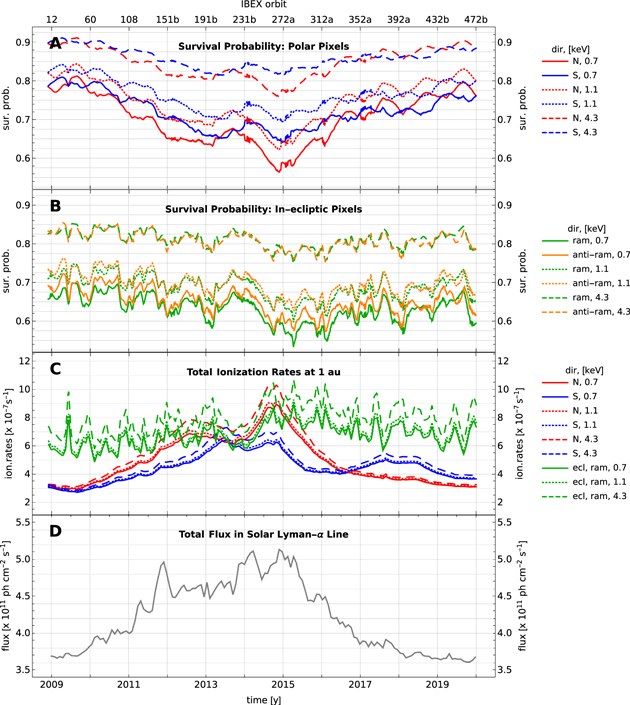


Figure B1. Survival probabilities for 0.7 (solid), 1.1 (dotted), and 4.3 (dashed) keV H ENAs in the polar (A) and in the in-ecliptic (B) IBEX pixels; energy-dependent total ionization rates for H ENAs in the polar directions and in the ecliptic plane at 1 au (C), and the total flux in the solar Lyα line (D). The occasional jitter in the survival probabilities between 2014 and 2017, visible in the top panel, results from specific variations of the spacecraft spin axis.
Download figure:
Standard image High-resolution image
Table B1. Summary of Source Files Used for Calculation of Survival Probabilities for H ENAs
| Quantity | Data source | Reference |
|---|---|---|
| In-ecliptic solar wind (proton speed, proton density, alpha-to-proton abundance) | OMNI data collection (data version released 2019 Apr 1, still available 2020 Jan 1) | King & Papitashvili (2005) |
| Solar wind latitudinal structure: proton speed (vp(φ,t)) | Revised IPS-derived solar wind speed data from 2011 to 2019, adjusted to the in-ecliptic speed from the OMNI data collection | Data: Tokumaru et al. (2011, 2012, 2015), Method: Sokół et al. (2020) |
| Solar wind latitudinal structure: proton density (np(φ,t)) | Based on the latitudinal invariance of the solar wind energy flux, calculated based on the OMNI in-ecliptic measurements with the alpha-to-proton abundance variable in time and (vp(φ,t)); averaged by moving average over 13 Carrington rotations | McComas et al. (2014a, 2017), Sokół et al. (2020), Le Chat et al. (2012) |
| Photoionization rates for H | Model based on TIMED/SEE/Level3/Version 12 data and he solar F10.7 index (solar radio flux in the 10.7 cm line) | Data: Woods et al. (2005, 2018), Tapping (2013), |
| Method: Sokół et al. (2020) | ||
| Radiation pressure | A model of evolution of the spectral profile of the solar Lyα line based on available observations of the profile from SOHO/SUMER and the total flux in the solar Lyα line following the composite series provided by LASP (version 4) | Data: Lemaire et al. (2015), Woods et al. (2000), Machol et al. (2020), Method: Kowalska-Leszczynska et al. (2018a, 2018b, 2020) |
| Electron impact ionization | Solar wind electron density calculated assuming solar wind quasi-neutrality, based on the solar wind proton density model and the time-variable alpha-to-proton abundance model. The density of electrons for the latitudes out of ecliptic was rescaled to follow the variation of the density of protons, while maintaining the ecliptic abundance of alpha particles. | Ruciñski & Fahr (1989, 1991), Bzowski (2008) |
Download table as: ASCIITypeset image
Charge exchange is a dominant ionization process for H ENAs (see, e.g., Figure 3 in Sokół et al. 2019). Thus, the total ionization rates follow the latitudinal variations of the solar wind structure over the solar cycle (Figure 5, therein). During low solar activity (at the beginning and at the end of Cycle 24), the total ionization rates in polar latitudes are lower than in the ecliptic plane. During the maximum of solar activity, the polar and in-ecliptic total ionization rates are very similar in magnitude (see panel C in Figure B1).
Moreover, as discussed by Bzowski (2008) and McComas et al. (2012), the survival probability correction depends on the ENA speeds relative to the solar wind and to the Sun. A faster speed relative to the Sun reduces the correction because the exposure of an ENA to the ionization factors is shorter in time, even though a faster speed increases the probability for charge exchange. The motion relative to the solar wind directly modifies the charge exchange rate: increasing the speed of this motion increases the charge exchange rate and reduces the survival probability, thus increasing the magnitude of the correction. Consequently, the corrections are different for the ram and anti-ram maps and for different energy steps.
Generally, corrections are the greatest for lower energy steps (see Figure 39 in McComas et al. 2012 and Figure 6 here). Figure B1 illustrates the survival probabilities for H ENAs of 0.7, 1.1, and 4.3 keV in the IBEX’s polar pixels (panel A) and in the in-ecliptic pixel (panel B) for the entire time span of IBEX observations. For reference, we also present the total ionization rates in the ecliptic plane and at the poles at 1 au from the Sun for atoms with the energies of 0.7, 1.1., and 4.3 keV (panel C; the spacecraft velocity is not included). It is interesting to note that during solar maximum, the polar and in-ecliptic ionization rates approximately level out for a longer period in the north (from about 2012 to 2015) and a shorter period in the south (about a year in 2013). The total flux in the solar Lyα line in the ecliptic plane at 1 au is presented in panel D of Figure B1. It is an indicator of the solar activity variation and a driving factor for the radiation pressure acting on H atoms.
The survival probabilities for H ENAs span from less than 0.6, for 0.7 keV atoms in the ecliptic plane and at higher latitudes during solar maximum, to more than 0.9, for 4.3 keV atoms at high latitudes during solar minimum. The temporal variation of the survival probabilities out of the ecliptic plane reflects the appearance and the disappearance of the fast solar wind in the polar latitudes together with the north/south asymmetry in the solar wind structure (Tokumaru et al. 2015, compare also panels A and C in Figure B1). The variation of survival probabilities in the ecliptic plane follows mainly the variation of the solar wind flux over the years, which, however, is not clearly synchronized with the solar cycle.
The radiation pressure modulates the variation of survival probability for H ENAs. Because of Doppler shifting of the ENAs, it is the most effective for atoms with radial speeds no more than ∼150 km s−1, i.e., mostly the atoms observed in the lowest energy steps (Bzowski 2008; Kowalska-Leszczynska et al. 2018b). Both of these effects, the ionization processes and the radial speed-dependent radiation pressure, are carefully accounted for in the estimates of the extinction correction for atoms measured by IBEX.